
Transforming Purchasing Power into a Performance-Driven Platform
Selected Work
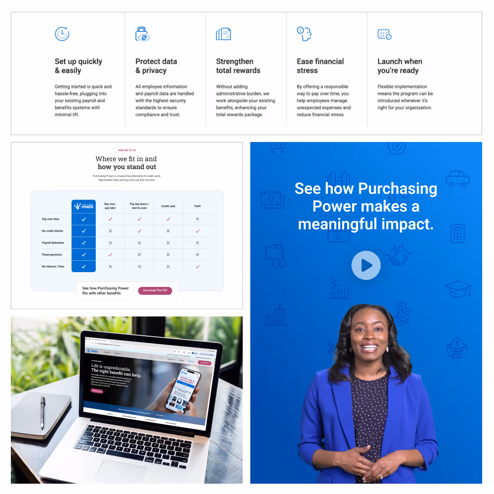
A closer look at the redesigned experience, built to simplify, support, and convert.


Simplifying Complexity to Drive Conversion Across Personas.
The core challenge was transforming a fragmented, underperforming website into a unified, scalable experience that could clearly communicate a complex, sensitive topic to a diverse audience while driving meaningful conversions and supporting sales goals.
Multiple Audiences
Purchasing Power serves distinct audiences with very different needs, from HR decision-makers evaluating benefits to employees seeking financial support. The experience needed to guide each group to relevant information quickly without creating friction or overlap.
Complex Product
The offering combines financial wellness, e-commerce, and employer-sponsored benefits, which makes it difficult to communicate simply. Without clear framing, users struggled to understand how it works, who it is for, and why it is valuable.
Lack of Cohesion
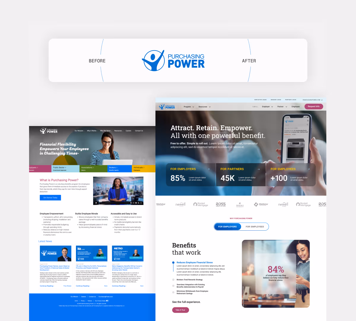
The B2B and B2C experiences felt disconnected, with inconsistent messaging, structure, and visual language. This created a fragmented brand experience and made it harder to tell a unified story across audiences.
Unclear Messaging
Key value propositions were buried or overly complex, making it difficult for users to quickly grasp the benefit. The site lacked clarity around outcomes, differentiation, and why Purchasing Power stood apart from alternatives.
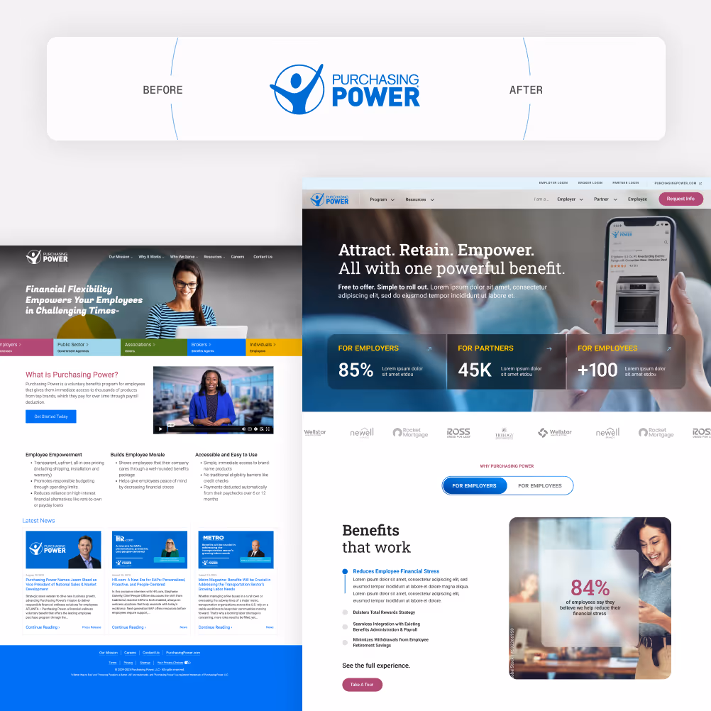
Rebuilding for Clarity, Scale, and Conversion
We rebuilt the site as a scalable foundation for both clarity and conversion. By restructuring user flows around clearly defined personas, refining content hierarchy, and simplifying B2B and B2C pathways, every decision, from architecture to interaction design, was made to communicate value clearly and guide each visitor toward meaningful action.


Key Design Decisions
The redesign addressed two intertwined challenges: a fragmented visual identity that felt misaligned with Purchasing Power’s broader brand, and a navigation structure that struggled to distinguish between its three distinct audiences: employees, employers, and partners. The solution tackled both simultaneously by using brand as the foundation and audience funneling as the structural principle.
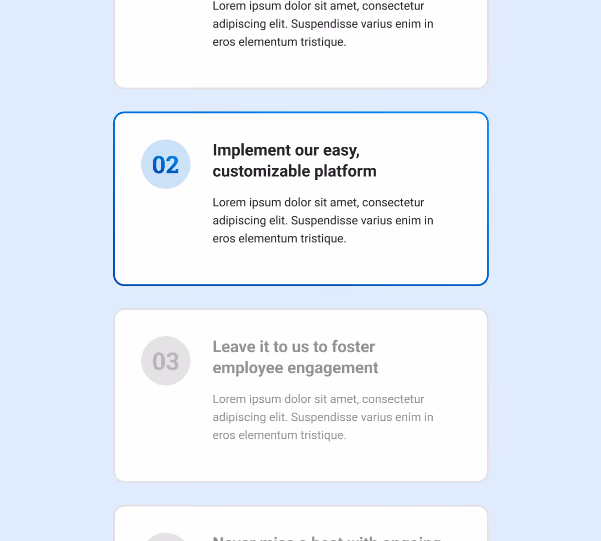
Streamlined nav bar + user journeys
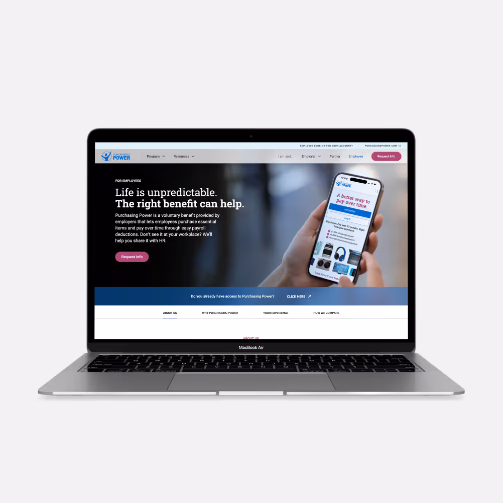
The homepage hero and navigation were designed to quickly surface the right value proposition for each persona and guide visitors to a relevant path within seconds of landing.
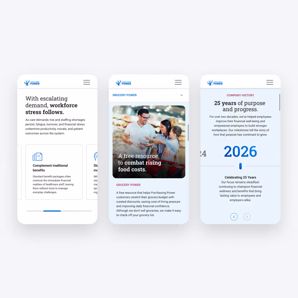
Component-based design system
A modular, component based system created consistency while enabling flexibility. Reusable components allow for faster updates, easier management, and scalable growth without constant redesign.
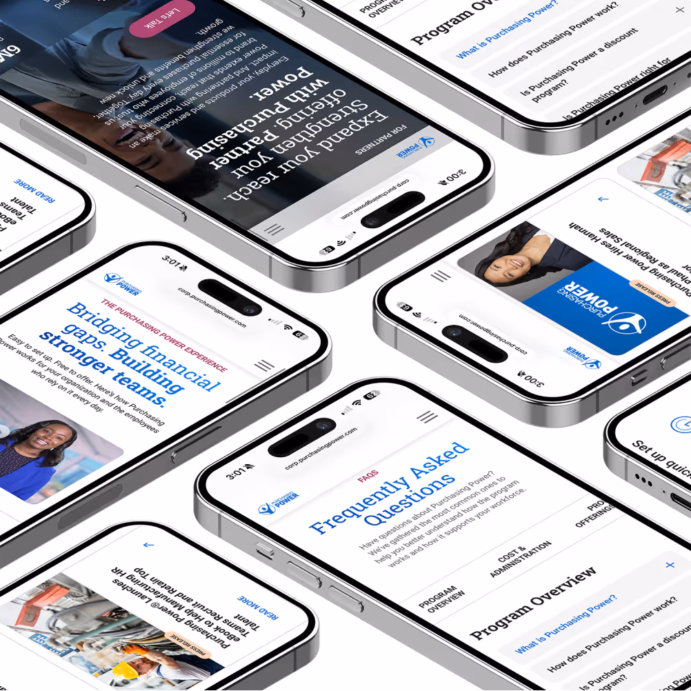
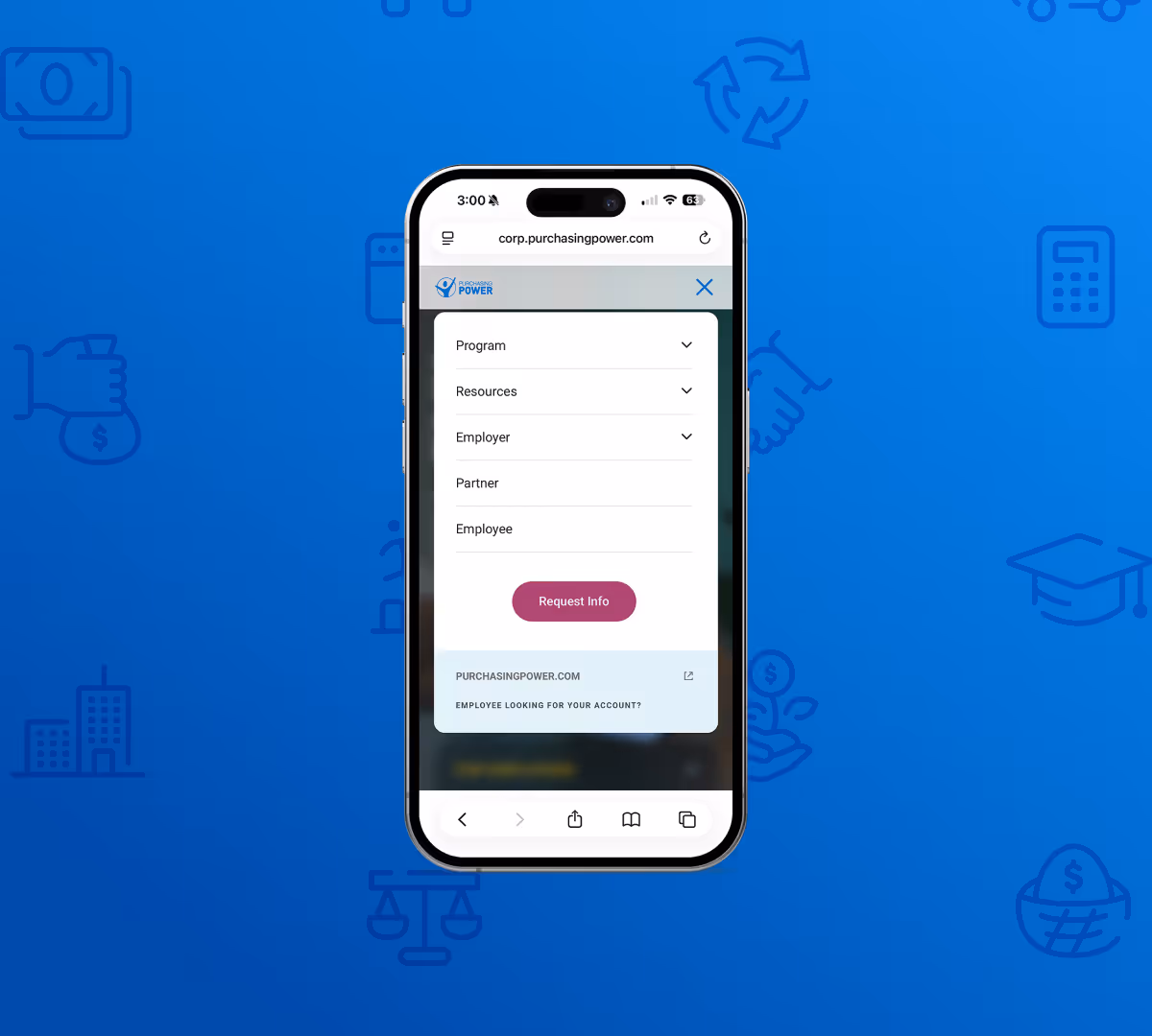
Fully responsive, mobile-first build
Initial research revealed that most users were accessing the site on mobile devices, making a mobile first approach essential. The fully responsive build ensures a seamless experience across devices.
Addition of animations, hover states, and video
Page animations, intentional hover states, and integrated video elements transform a static browsing experience into a dynamic one, making the site feel more elevated while reinforcing brand recognition across touchpoints.
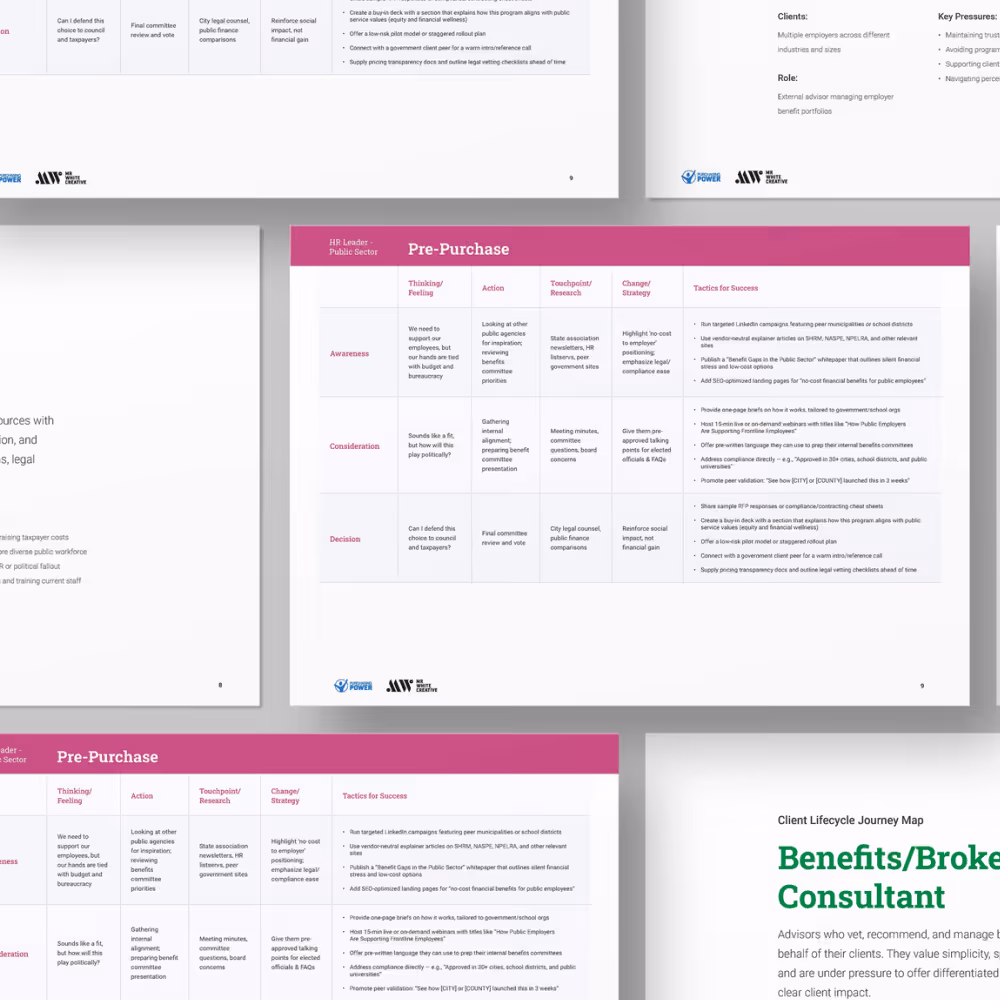
Wireframes, Research, & More
Months of stakeholder and user interviews informed a centralized view of user intent, which directly shaped our site structure strategy.


How we built this visual system
Discovery phase
We began with stakeholder interviews, user insights, and a review of existing site performance to understand key pain points and opportunities. This phase focused on uncovering how different audiences engage with Purchasing Power, where friction existed, and what was needed to better support both B2B and B2C journeys.
Structure
Using these insights, we reworked the site architecture to better align with user intent. We simplified navigation, introduced clearer pathways by audience and use case, and established a scalable framework that could support future content and growth without adding complexity.
UX
With a strong foundation in place, we designed intuitive, conversion-focused experiences that made it easier for users to find value quickly. We prioritized clarity in messaging, reduced friction across key flows, and ensured the experience worked seamlessly across devices, with a strong emphasis on mobile.
Visual System
We evolved the visual language to feel more modern, cohesive, and aligned with the brand’s value. This included refining typography, color, and component styles while building a flexible, component-based system that ensured consistency across pages and use cases.
Launch + Support
We supported launch through close collaboration with developers and stakeholders, ensuring designs were implemented accurately and efficiently. Post-launch, we continued to monitor performance, address gaps, and refine the experience through ongoing updates, positioning the site as a living product that could evolve alongside the business.
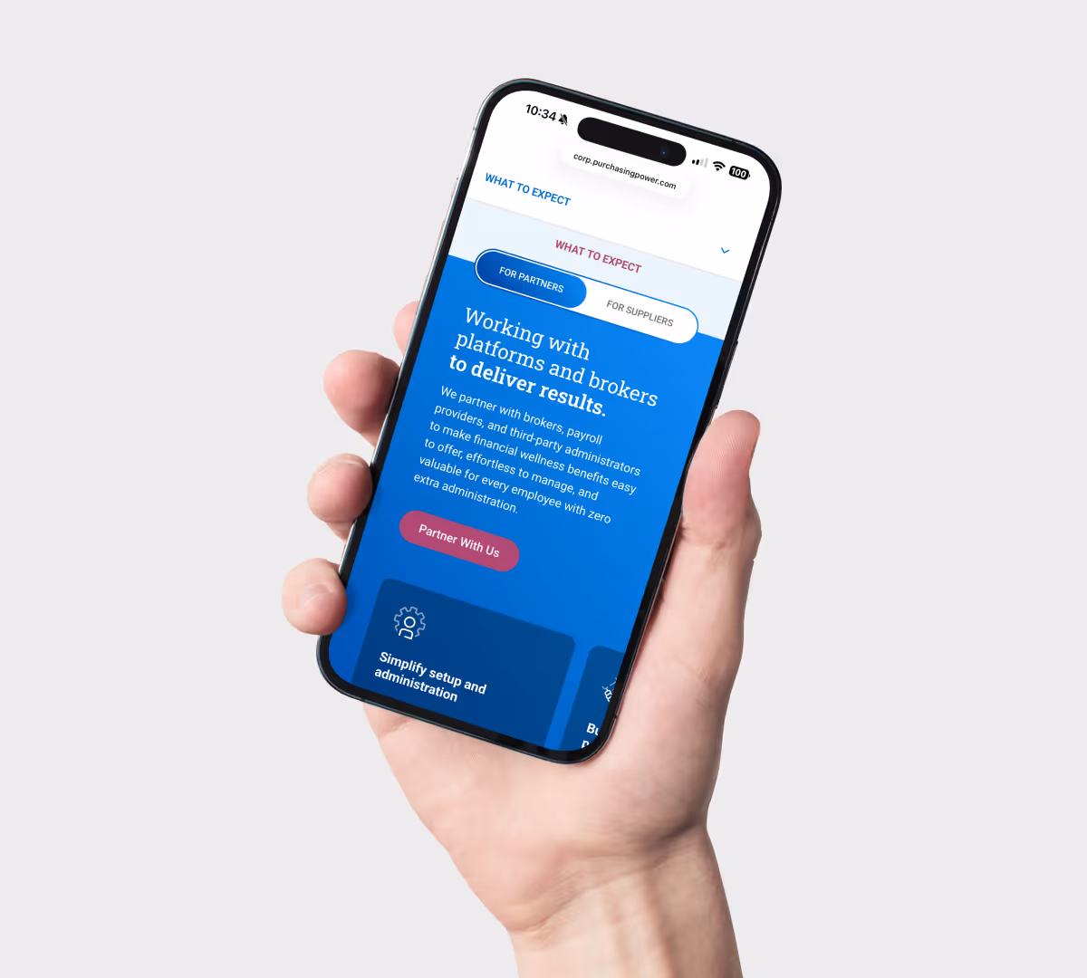
Audience Funneling
The homepage hero introduces a toggle that immediately routes visitors into the experience relevant to them, reducing cognitive load and surfacing the right value proposition from the first scroll.
A Unified Experience Built to Perform
The result was a clear, cohesive experience that improved usability, strengthened messaging, and increased conversions while building trust across both B2B and B2C audiences. The new platform aligned brand, experience, and performance, establishing a strong foundation for ongoing growth. Defined personas and streamlined user flows ensured the site communicates clearly and guides visitors toward high value conversions.
Of research and development went into the design of this new site.
Custom scalable website built to serve mulitple audiences with different needs.
Acquistion of Purchasing Power by PROG Holdings following the rollout of the new B2B site.

| Key Insight
A website launch is not the finish line. Without a system built for iteration, optimization, and growth, even the best design quickly loses value. The real impact comes from treating the website as a living performance engine, not a one-time deliverable.

| Final Takeaway
This redesign reinforced the importance of aligning UX, content, and visual systems around clearly defined goals and user needs. By simplifying complex information, supporting multiple audiences, and building a scalable design foundation, the site evolved into a more credible, conversion-focused experience.
See More Work
Start Something New
Explore my portfolio or reach out to discuss your next project!