
Bringing Clarity to Complex Data Automation Solutions
Making the Invisible Understandable
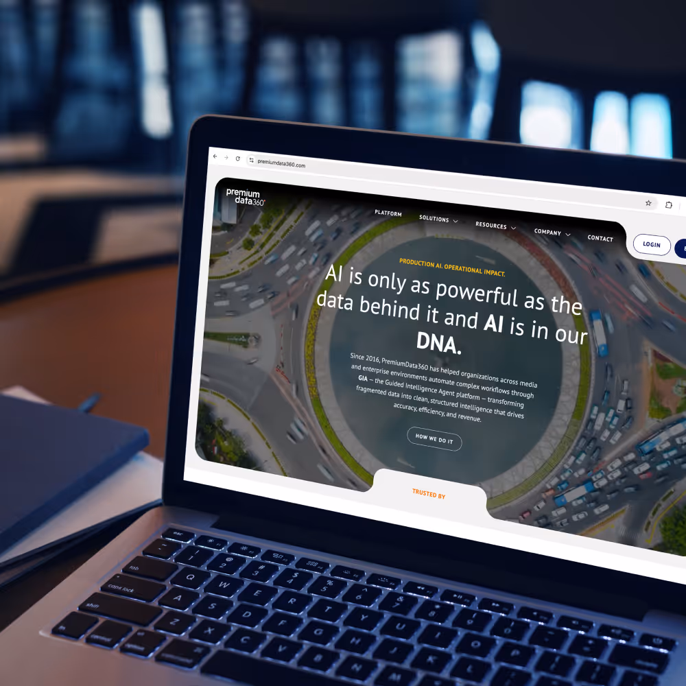
PD360 operates in a highly technical and competitive space where communicating value clearly is a constant challenge. The existing experience lacked the structure, clarity, and differentiation needed to support complex use cases and position the brand as a leader. The goal was to create a more cohesive system that simplifies complexity and scales across industries.
Abstract and Complex Offering
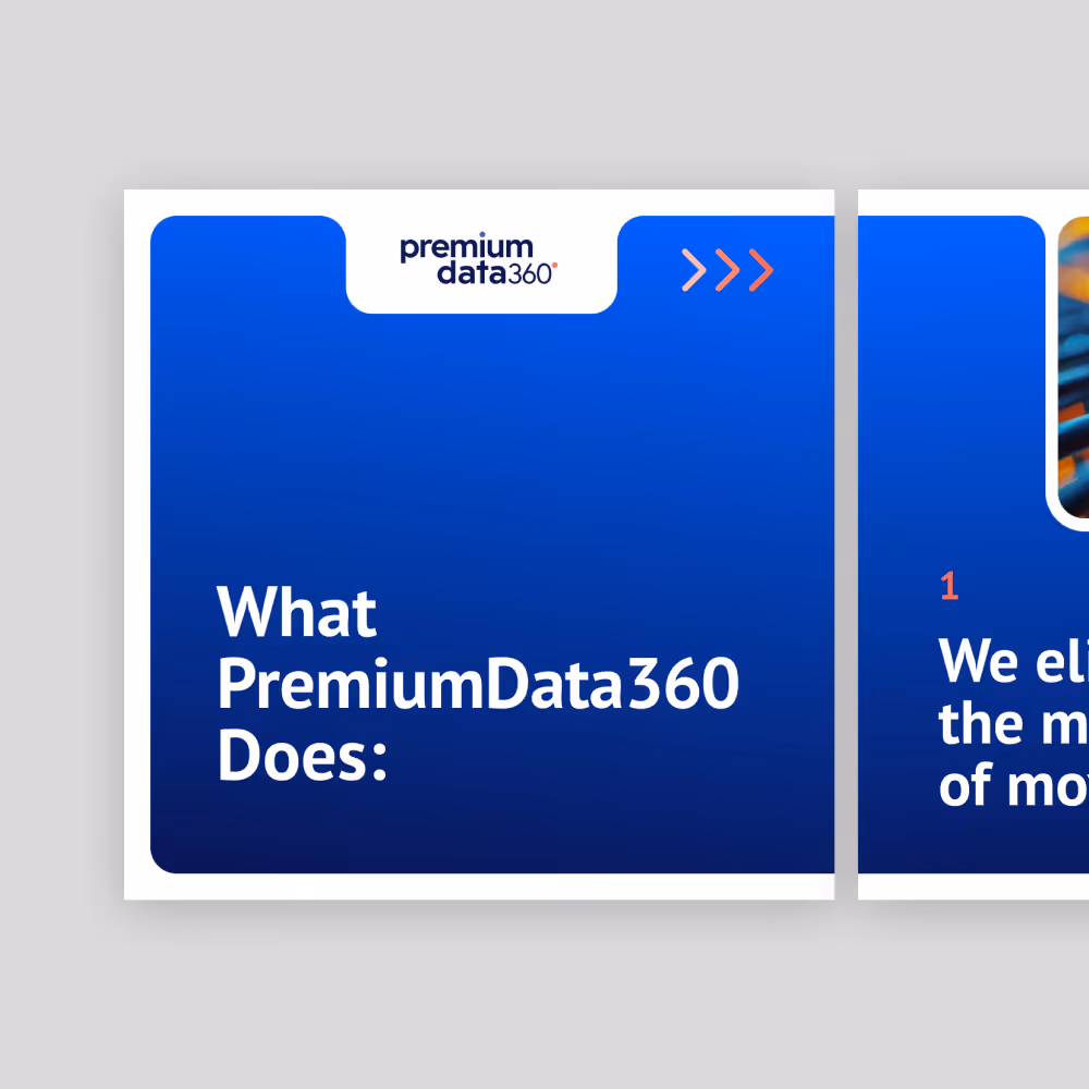
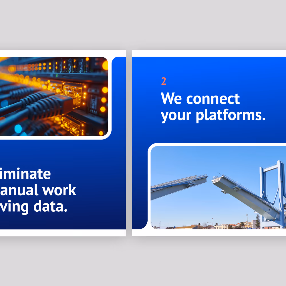
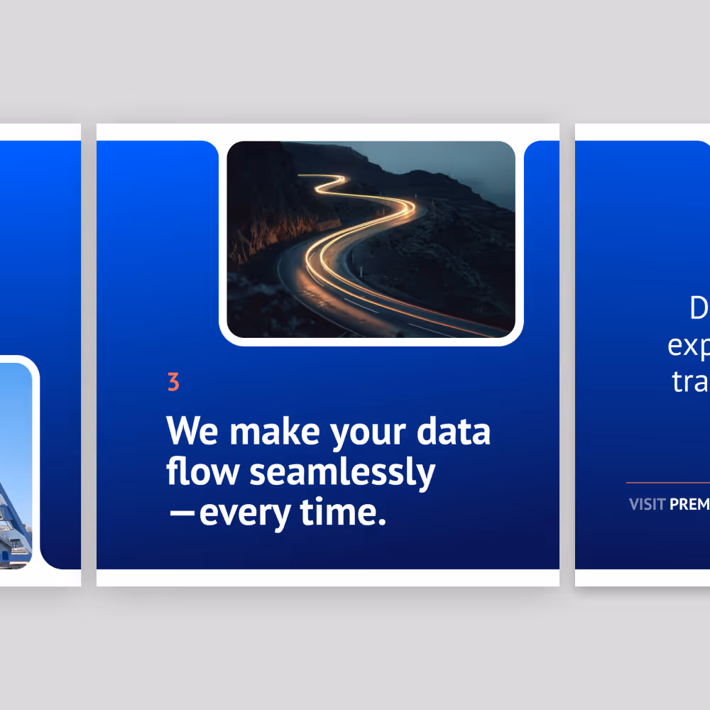
PD360’s core value lies in data automation, system integration, and real-time data flow, all of which are difficult to visualize and communicate. The challenge is translating abstract, backend-heavy concepts into something clear, tangible, and easy to understand.
Niche, Highly Informed Audience
The audience includes technical stakeholders who expect precision, clarity, and credibility. Messaging must strike a balance between being accessible and maintaining the depth and accuracy needed to build trust with a knowledgeable audience.
Multiple Use Cases Across Many Industries
The previous site struggled to support large amounts of technical content across multiple use cases and industries. Without a clear structure, users lacked intuitive pathways to navigate and understand how solutions applied to their specific needs.
Lack of Differentiation in a Saturated Market
Operating in a crowded space filled with similar claims around AI and automation, PD360 lacked a distinct voice and visual identity. The challenge was to create a brand and experience that clearly communicates value while standing apart from competitors.
Structuring Complexity into Clear Systems
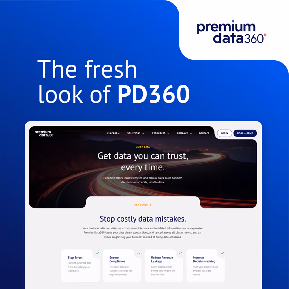
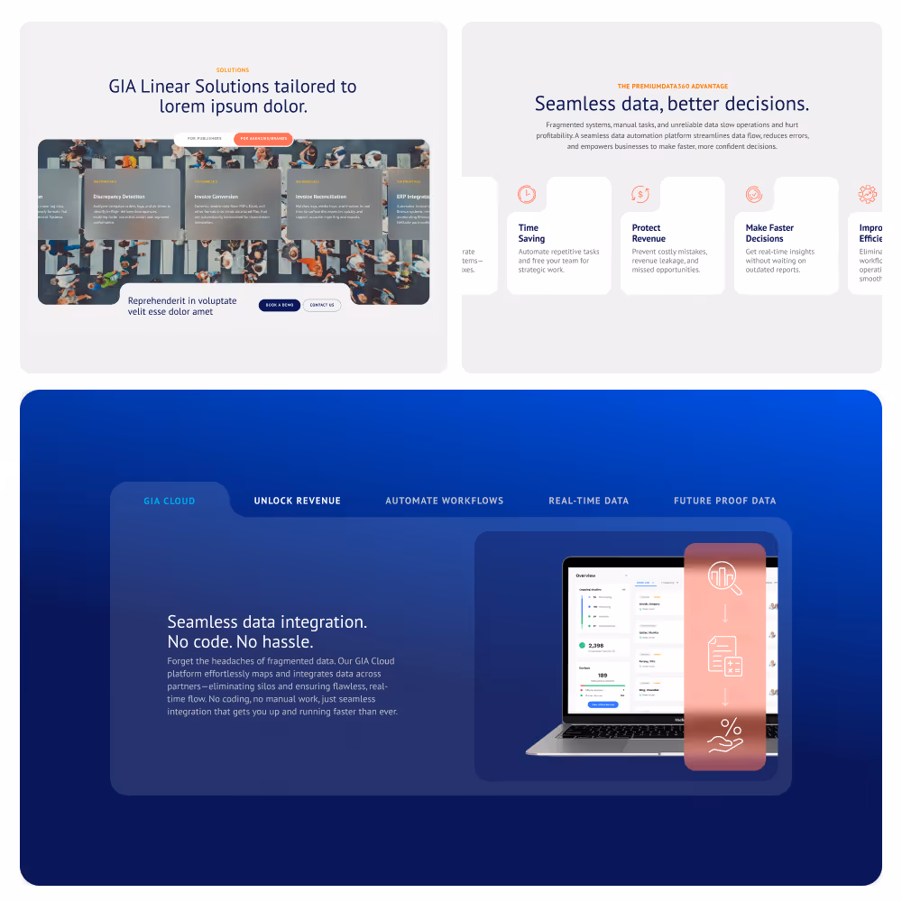
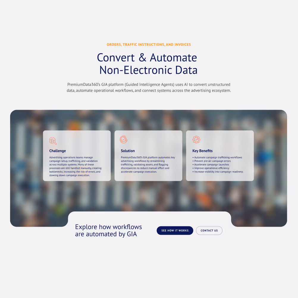
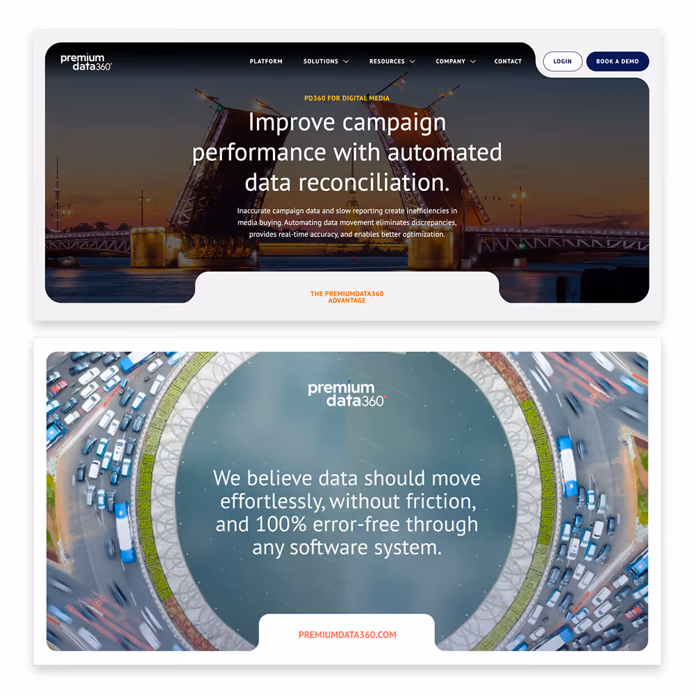
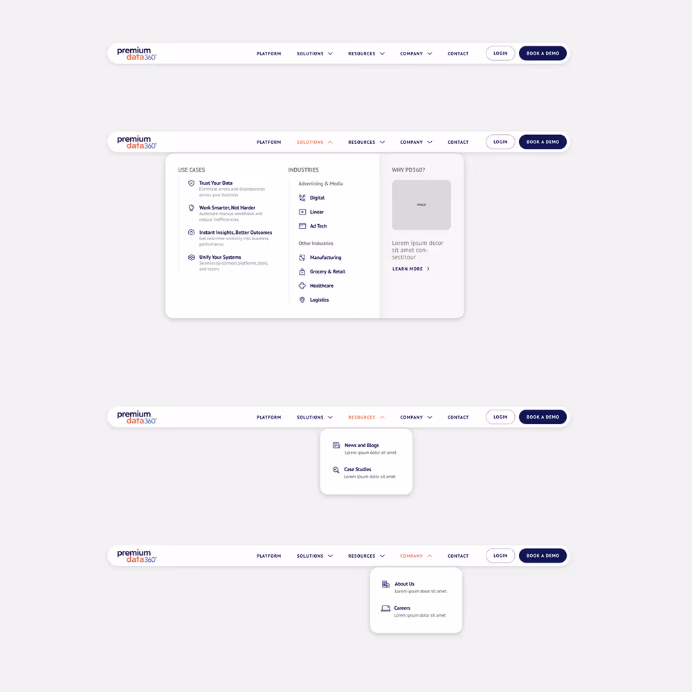
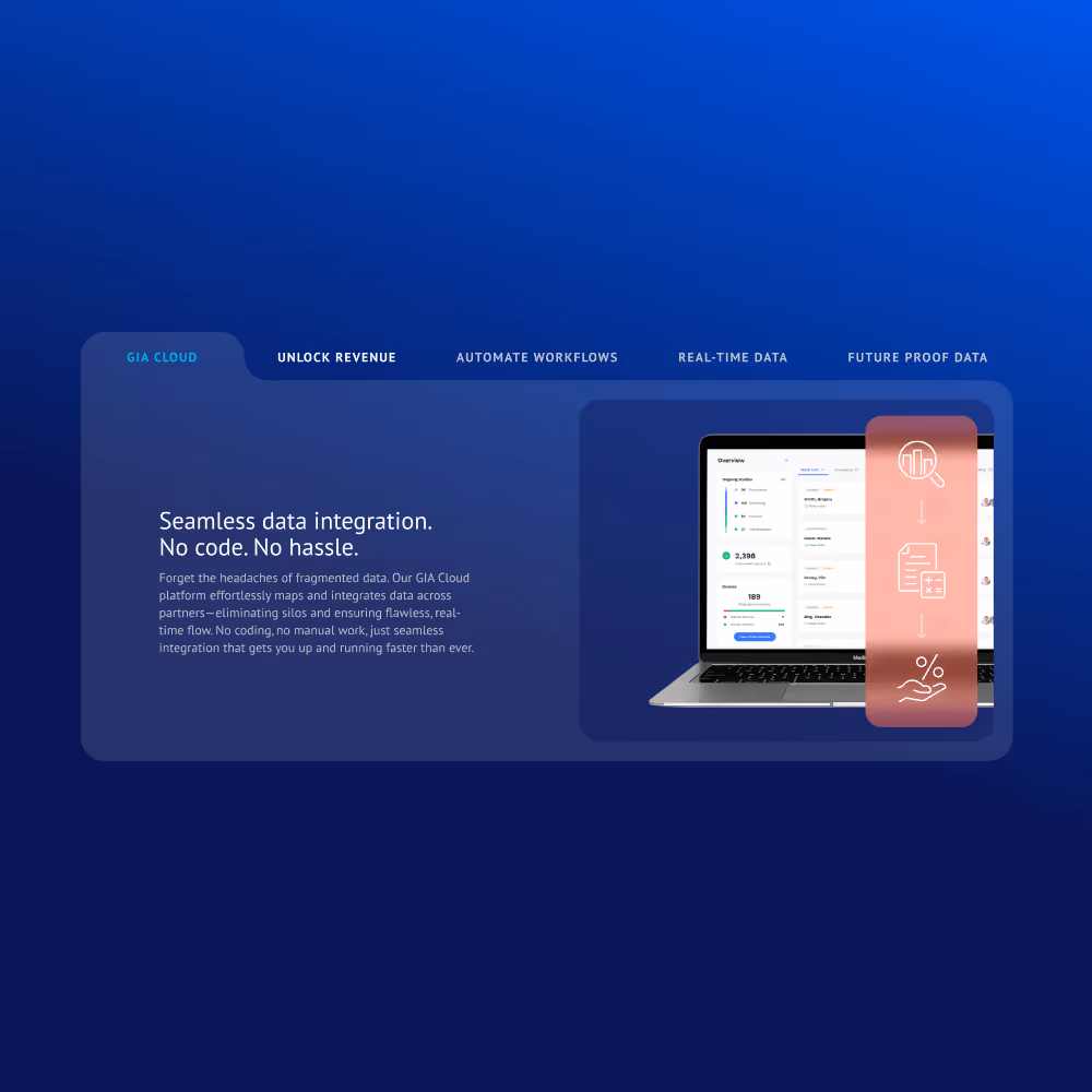
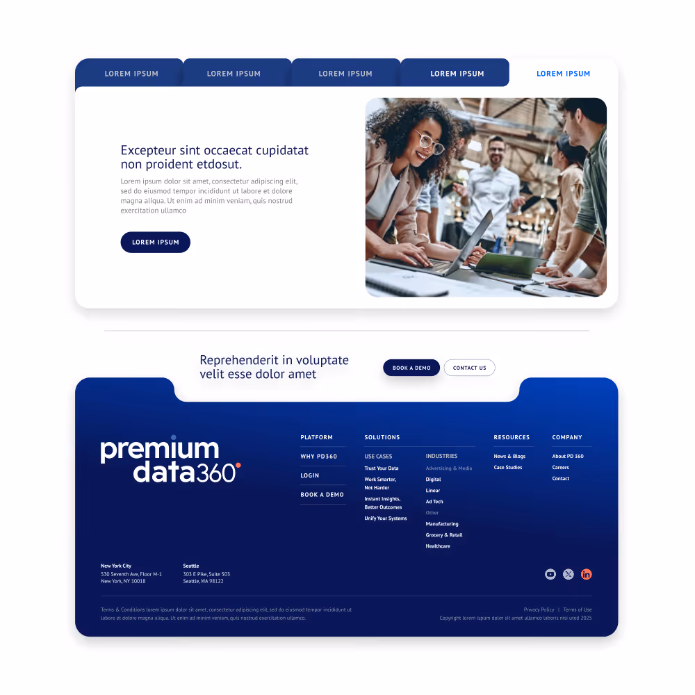
We approached the project as both a brand and systems challenge. The rebrand introduced a modern, cohesive identity designed to reflect precision, intelligence, and efficiency. From there, we rebuilt the website with a flexible, component-based system capable of supporting content-heavy pages and multiple use cases. Messaging was restructured around user intent, focusing on clear benefits like efficiency, accuracy, and speed. To support scalability, we introduced a color system and modular components that allow content to be organized, categorized, and expanded across industries without losing clarity or cohesion.
Key Design Decisions
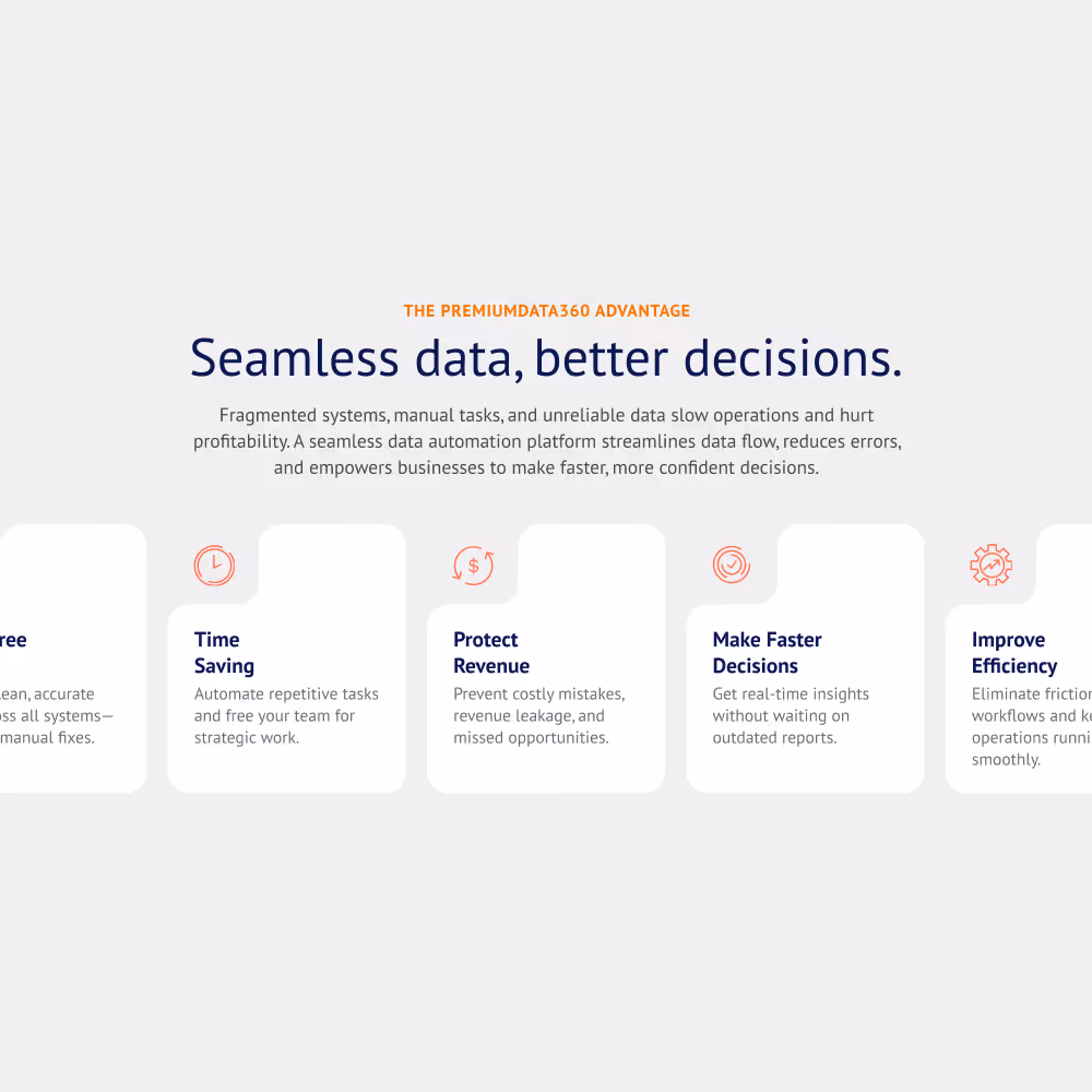
A structured visual system brings abstract concepts into a more tangible, intuitive experience. Modular components, clear hierarchy, and a purposeful color tagging system organize complex content into distinct pathways across use cases and industries.
Visualizing Invisible Systems
We developed a visual language that represents data movement, automation, and connectivity in a way that feels modern and intuitive without relying on overused or overly literal tech tropes.
Designing for Multi-Industry Flexibility
With multiple use cases spanning industries, the system was built to adapt content without requiring redesign, supporting both current and future expansion.
Color as a System for Organization
A structured color system was introduced to classify content, differentiate use cases, and help users navigate across industries and solutions.
Component-Based Architecture
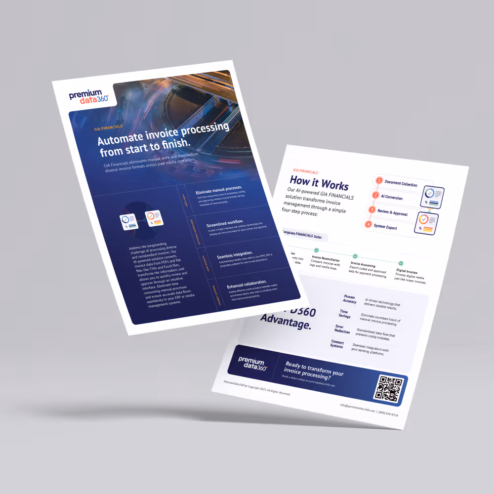
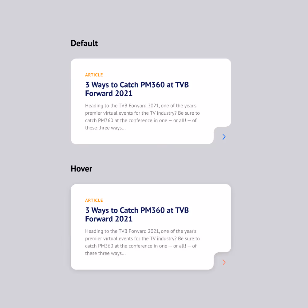
Custom, dynamic components were designed to support dense, technical messaging while maintaining clarity and usability across pages

How we built this visual system
Discovery phase
Identified key challenges, pain points, and goals for the new website through stakeholder discussions and user interviews
Structure
Refined the sitemap and user flows based on stakeholder insights and user research
UX
Solidified the content strategy and streamlined UX approach through wireframes and content exploration
Visual System
Established a scalable visual system, templates, and flexible components to support future growth and ongoing site management
Launch + Support
Launched the website and provided ongoing support, including marketing materials and industry-specific campaigns
Personalized User Journeys Without Added Friction
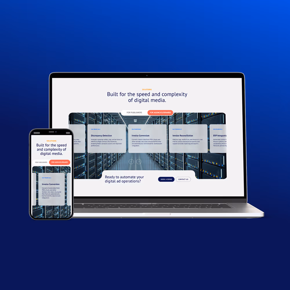
Toggle and tab components allow users to switch between key personas and tailored solutions, surfacing relevant content instantly and reducing the need to navigate or scroll.
A Platform That Positions and Performs
The result is a modern, scalable brand and website that clearly communicates PremiumData360’s value in a complex space. The new platform positions the company as a credible, forward-thinking leader while making its offering more accessible to a niche audience. With a flexible system in place, the site can evolve alongside the business, supporting new use cases, industries, and content without sacrificing clarity or consistency.
Step comprehensive process from discovery to launch and beyond.
Of Gold at the 2025 W3 Awards for "General Websites-Website Redesign"
Use cases across seven industries highlight the need for scalability and clear user journeys.
| Key Insight
When products are complex, clarity does not come from simplification alone. It comes from structure. By building a system that organizes content, messaging, and visuals, complex ideas become easier to understand, navigate, and scale.
| Final Takeaway
Complex products don’t need complex experiences. With the right structure and systems in place, even the most technical offerings can be communicated with clarity, consistency, and confidence.
See More Work
Start Something New
Explore my portfolio or reach out to discuss your next project!