
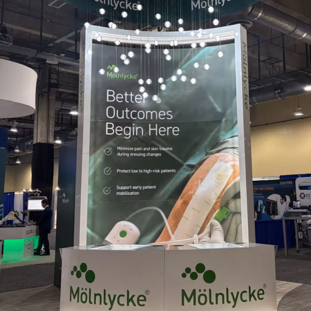
Sustaining Consistency Across a Global Healthcare Company

Complexity, Scale, and Alignment Across Teams
Supporting a global healthcare brand at scale meant navigating complexity on multiple levels. A diverse and highly technical product portfolio required translating clinical data into accessible, compliant messaging. At the same time, multiple internal teams and external partners introduced challenges around alignment, brand consistency, and competing priorities. Balancing regulatory constraints, evolving product needs, and high-volume production required a system that could maintain clarity, cohesion, and speed without compromising quality.
Highly Technical Product Portfolio
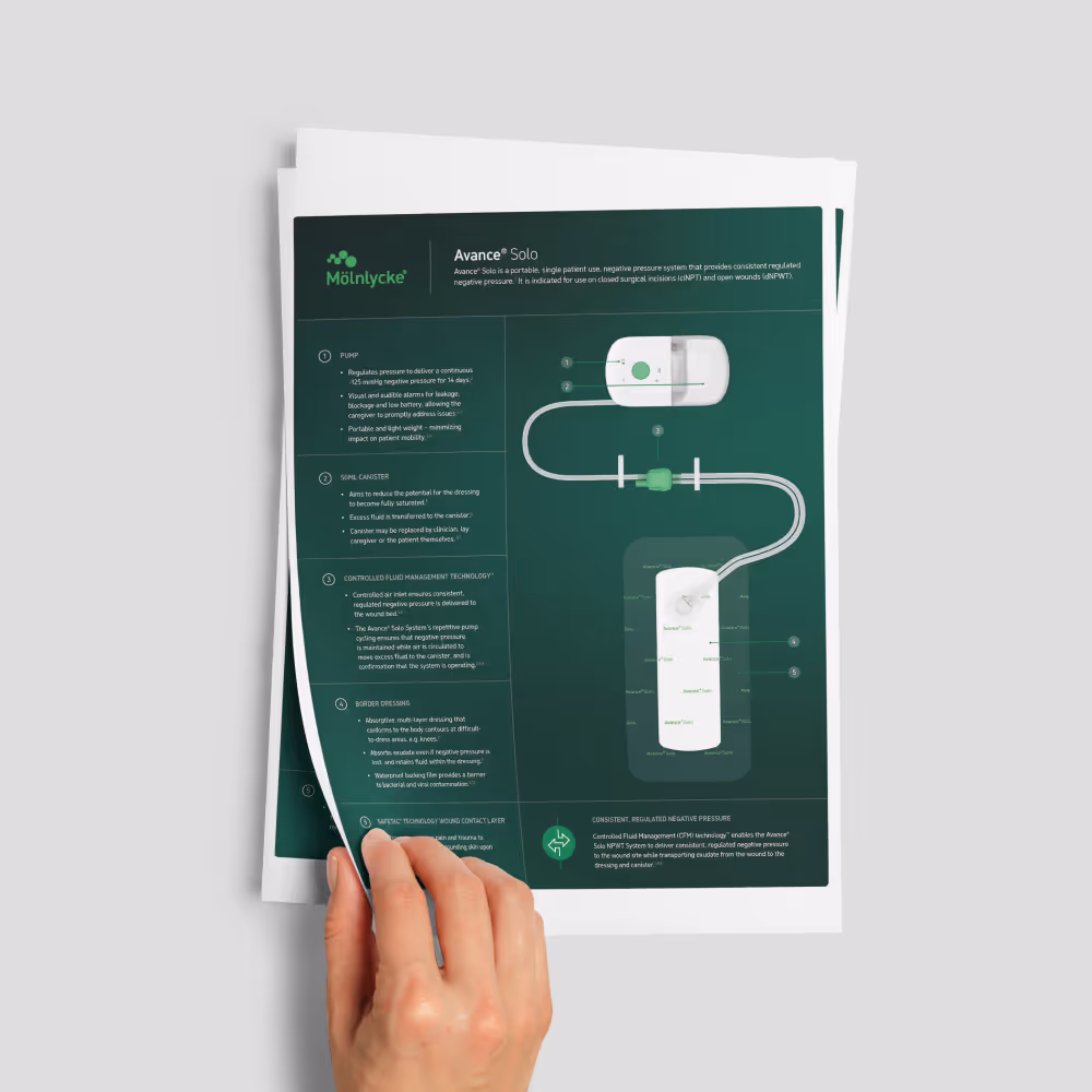
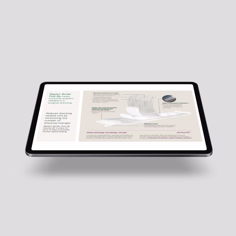
Mölnlycke’s diverse product portfolio is rooted in complex clinical functionality. The challenge is translating technical features into messaging that is accessible, relevant, and easy to understand without oversimplifying the science.
Compliant Clinical Messaging
All communications must align with strict regulatory and clinical standards. Messaging needs to accurately reflect supporting data while remaining clear and usable for marketing, sales, and clinical audiences.
Ongoing High-volume Production
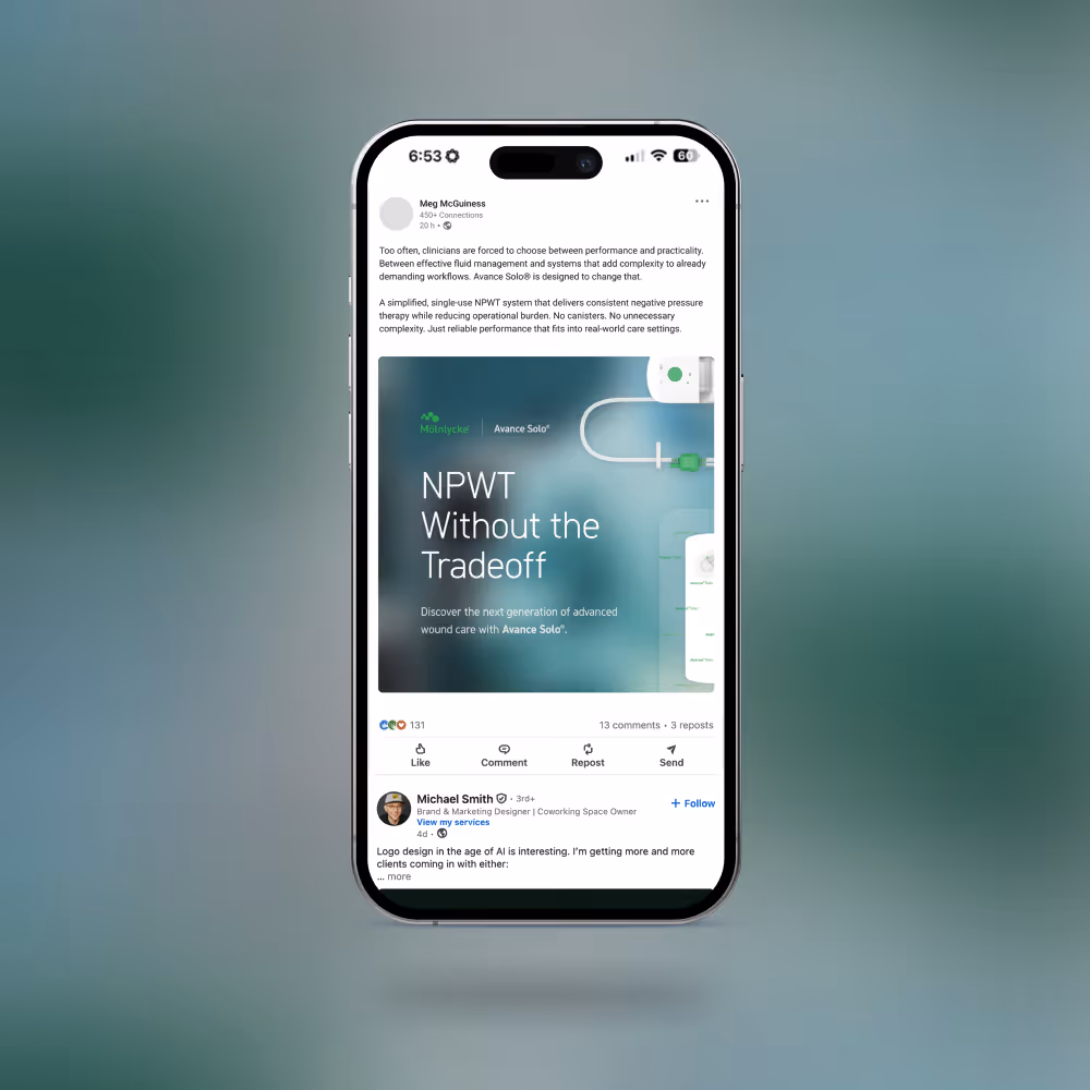
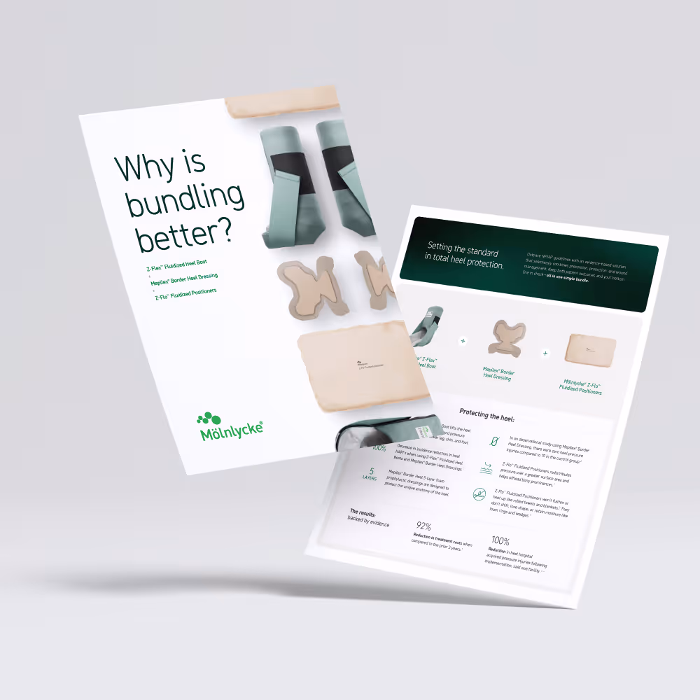
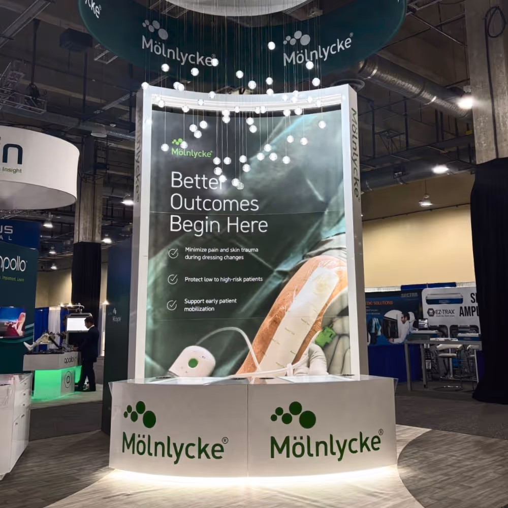
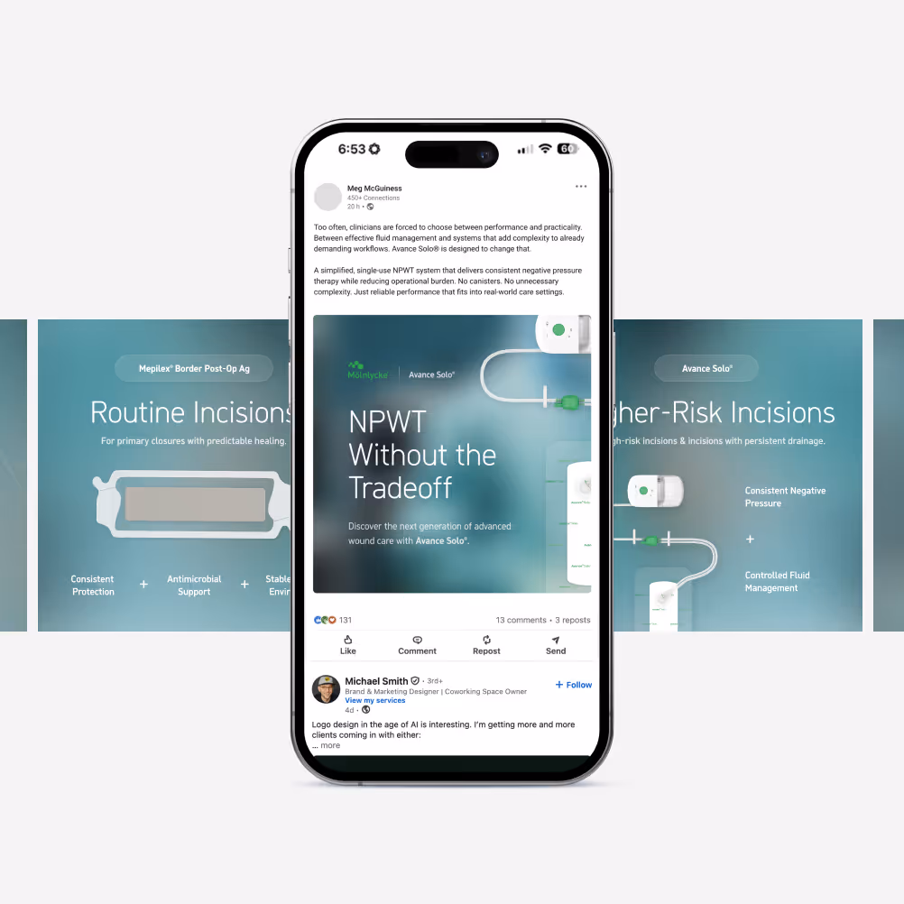
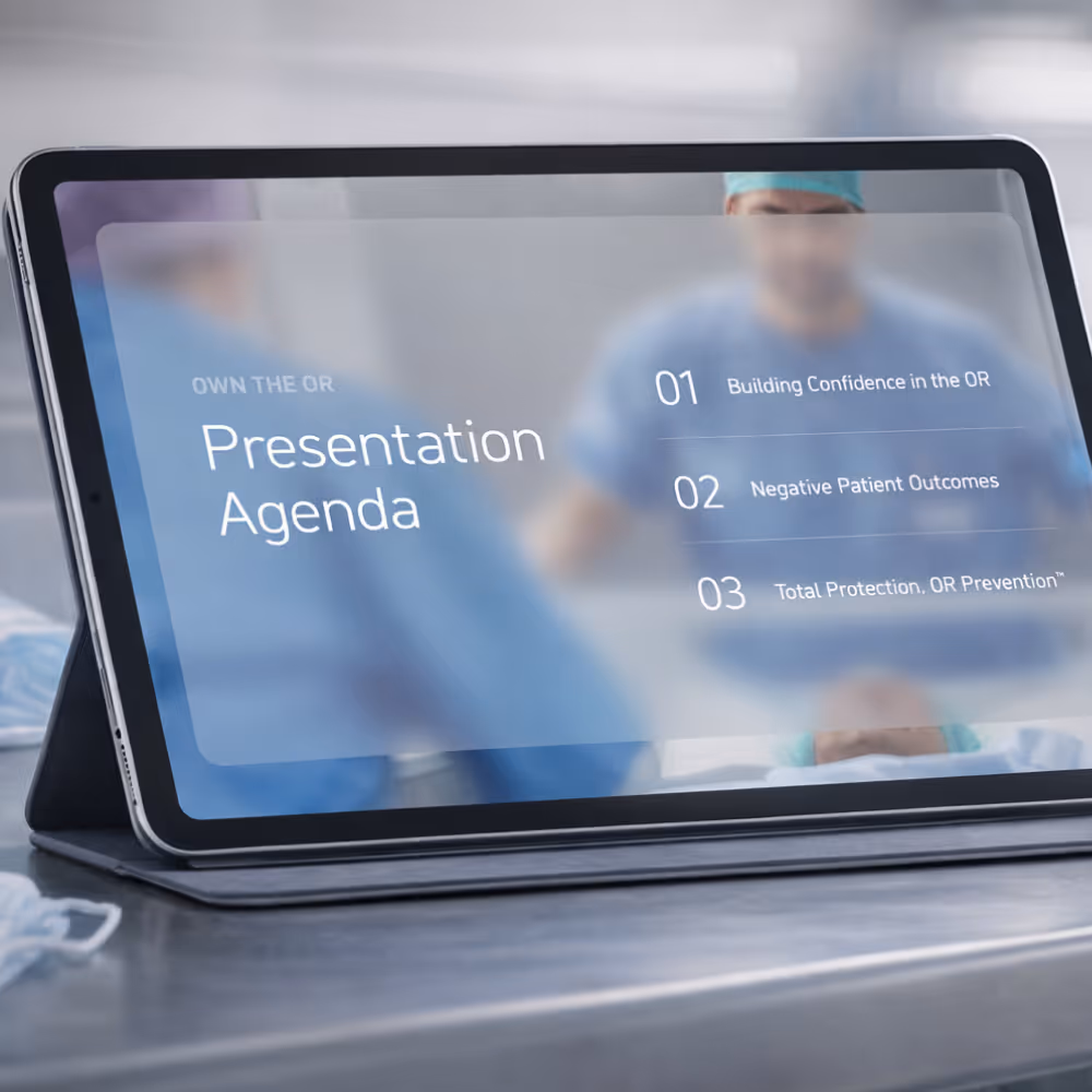
The scope of work spans a large volume of deliverables across multiple channels, including digital, print, and sales materials. Maintaining efficiency and quality at scale requires a structured, repeatable approach.
Brand Consistency Across Teams
With multiple teams, regions, and contributors involved, maintaining a cohesive visual and messaging system is a constant challenge. Ensuring consistency across touchpoints is critical to building trust and reinforcing the brand.
Establishing a Shared System and Visual Language
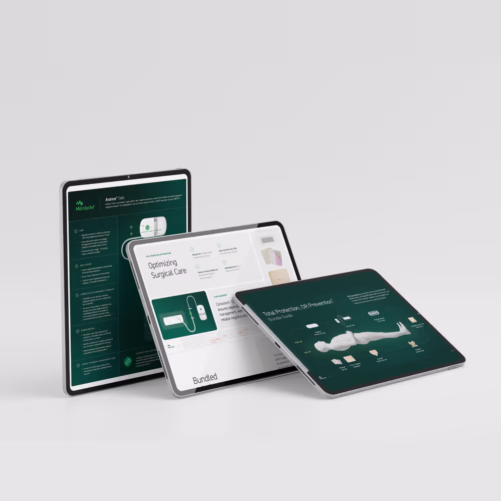
We approached the partnership as both a creative and strategic role, helping establish consistency across touchpoints by evolving brand standards, differentiating product lines, and aligning visual language. Through repeatable frameworks and refined messaging, we supported scalable growth while maintaining clarity and compliance across everything from enterprise campaigns to technical product materials.
Key Design Decisions
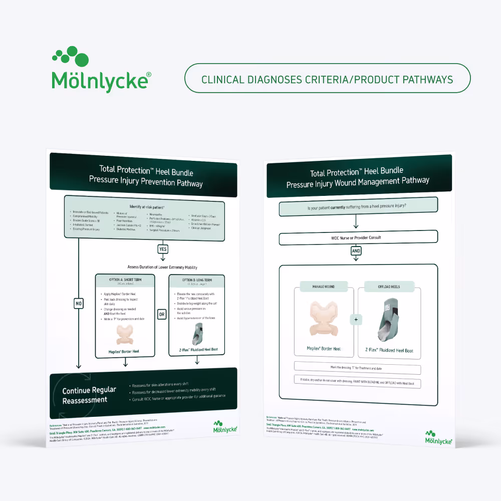
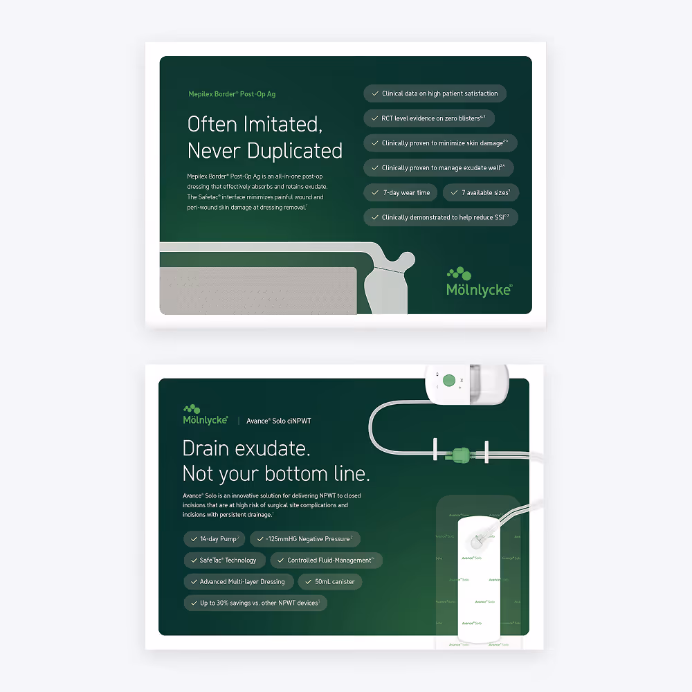
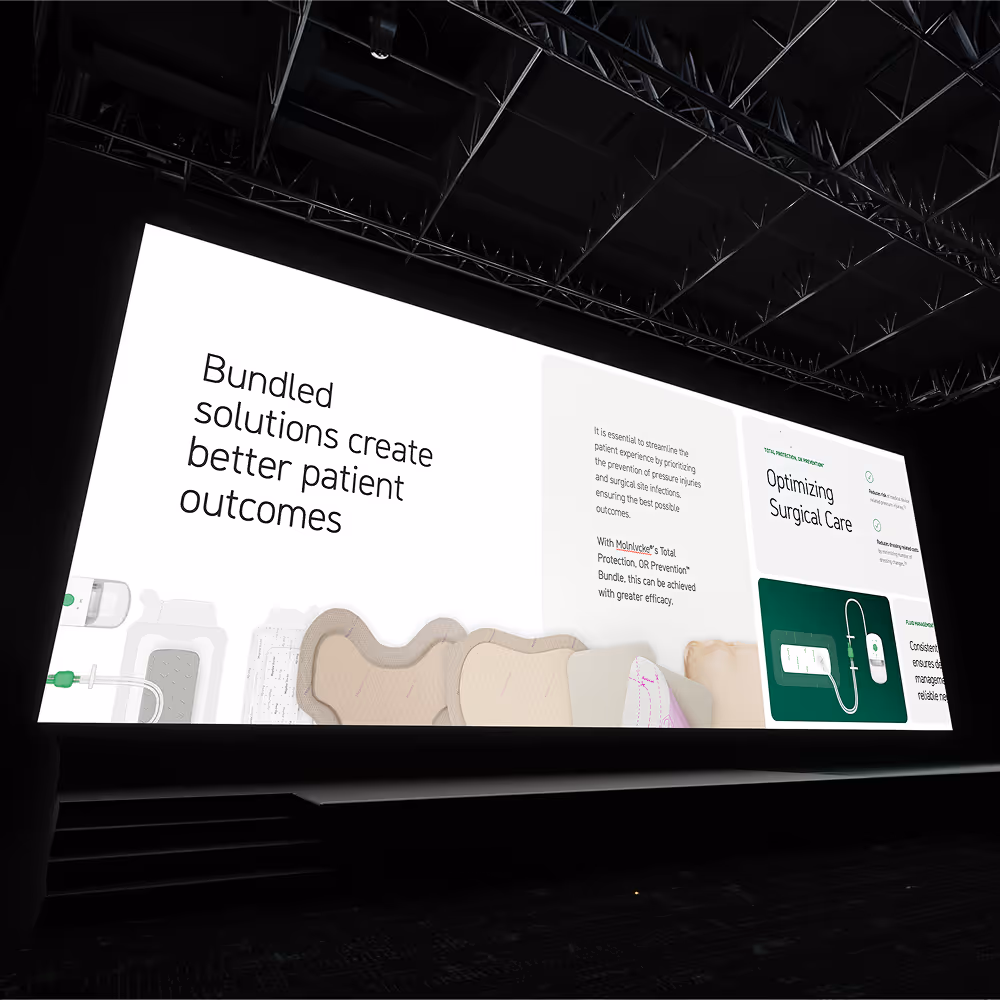
This work focuses on making complex clinical messaging clearer, more differentiated, and easier to engage with. Templates and repeatable systems support high-volume production and sales enablement, while color, 3D product visuals, and structured layouts help each product stand out and communicate its value. By refining and extending the existing brand, the result is a more cohesive system that helps teams move faster, stay compliant, and communicate with confidence.
Product differentiation through design
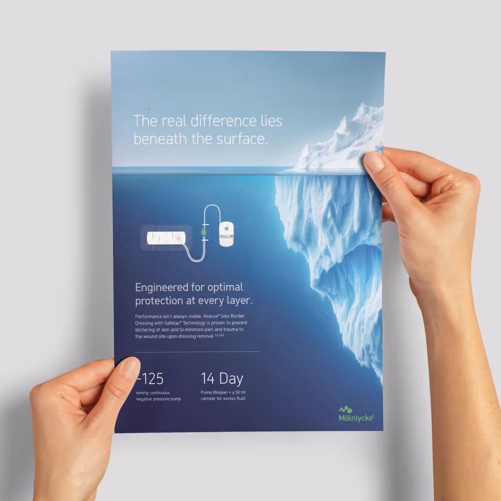
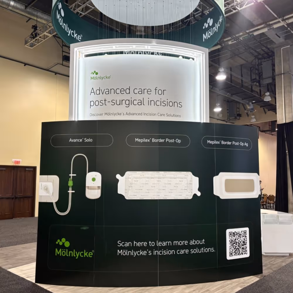
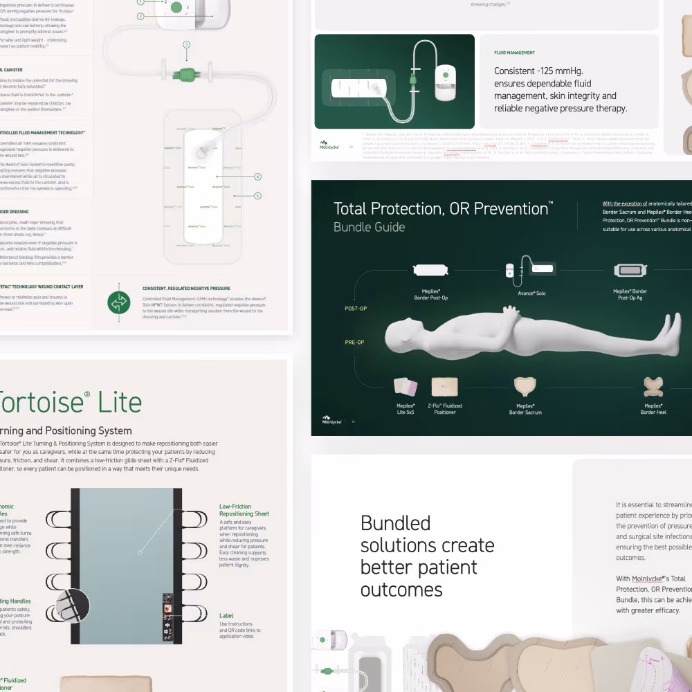
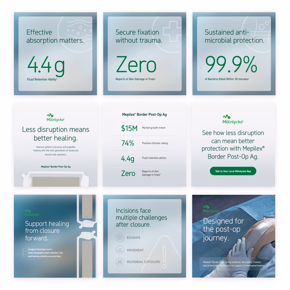
A subtle color system is used to distinguish product lines and create immediate visual recognition across materials. 3D product renders and pill-based visual treatments highlight key product features and reinforce form and function, helping communicate differences in use case, performance, and value in a consistent way.
Elevating the Existing Visual Language
Through the use of 3D renders, dark gradients, background blur, and layered opacity, we introduced a more modern, refined visual language while preserving clinical credibility. In a saturated market, credibility, product performance data, and visual appeal play a critical role in differentiation and impact.
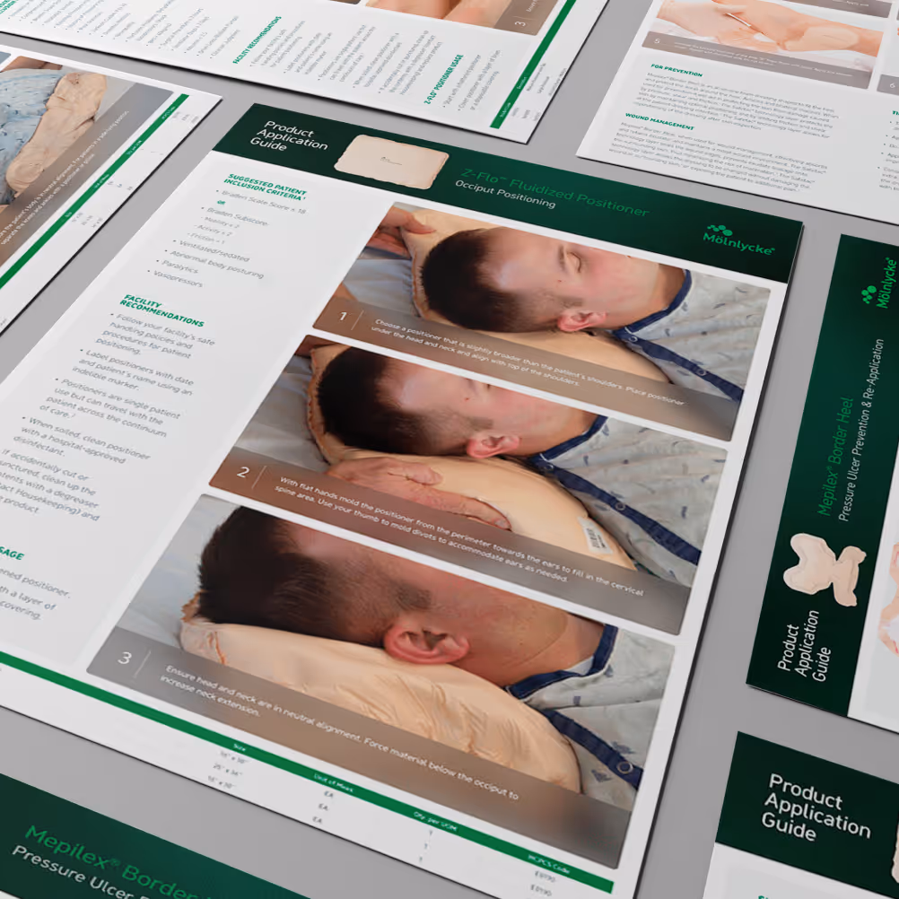
Development of repeatable frameworks
Flexible, repeatable design frameworks are established to support a high volume of deliverables across teams and regions. This approach ensures consistency while enabling efficient production and scalability over time.
Translating Complexity into Clarity
Complex clinical concepts are distilled into clear, structured communications that are easy to understand and act on. Design and content work together to simplify without losing accuracy or credibility.

Stronger Alignment, Smoother Execution
This ongoing partnership has resulted in a more cohesive and scalable brand presence across a wide range of touchpoints. Marketing and educational materials now communicate more clearly, align more consistently, and better support both internal teams and external audiences. By establishing systems and elevating the visual language, Mölnlycke is able to move faster, maintain brand integrity across regions and teams, and present a more unified, modern identity in the market.
Years of ongoing partnership, expanding across additional product teams and campaigns
Assets delivered annually across campaigns, sales, and education
Product lines supported within a unified design system
| Key Insight
In a highly competitive MedTech market, clarity and differentiation are critical. By pairing competitor analysis with a structured design system, we created a framework that allows each product line to be quickly identified while still reinforcing the strength of the master brand. This balance of distinction and cohesion helps teams communicate more effectively in high-stakes sales environments.

Dive Deeper on Behance
Check out Behance for extended case studies, experiments, and supporting work.
| Final Takeaway
A global brand is defined not just by how it’s designed, but by how consistently it’s applied. By establishing clear systems and shared standards, we enabled Mölnlycke to scale its brand across teams, products, and touchpoints without losing cohesion, credibility, or clarity. View the Huxley Medical case study for a additional look at how design systems were applied within a healthcare environment.
See More Work
Start Something New
Explore my portfolio or reach out to discuss your next project!